Brand and Identity
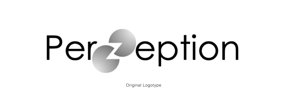
Our client already had a logo coming into this project, but were open to changes. A key part of their current logo that they wanted to keep was the Kanizsa, an optical illusion of two circles with triangular openings that resembled a “Z”. We experimented with the shape of the Kanizsa, other optical illusions, and if the Kanizsa could make a different shape.
![]()
After three rounds of surveys with 79 total participants, we arrived at our final logo, based on the “impossible” Penrose Triangle illusion.
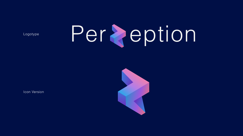
Logotype
Our client already had a logo coming into this project, but were open to changes. A key part of their current logo that they wanted to keep was the Kanizsa, an optical illusion of two circles with triangular openings that resembled a “Z”. We experimented with the shape of the Kanizsa, other optical illusions, and if the Kanizsa could make a different shape.
After three rounds of surveys with 79 total participants, we arrived at our final logo, based on the “impossible” Penrose Triangle illusion.