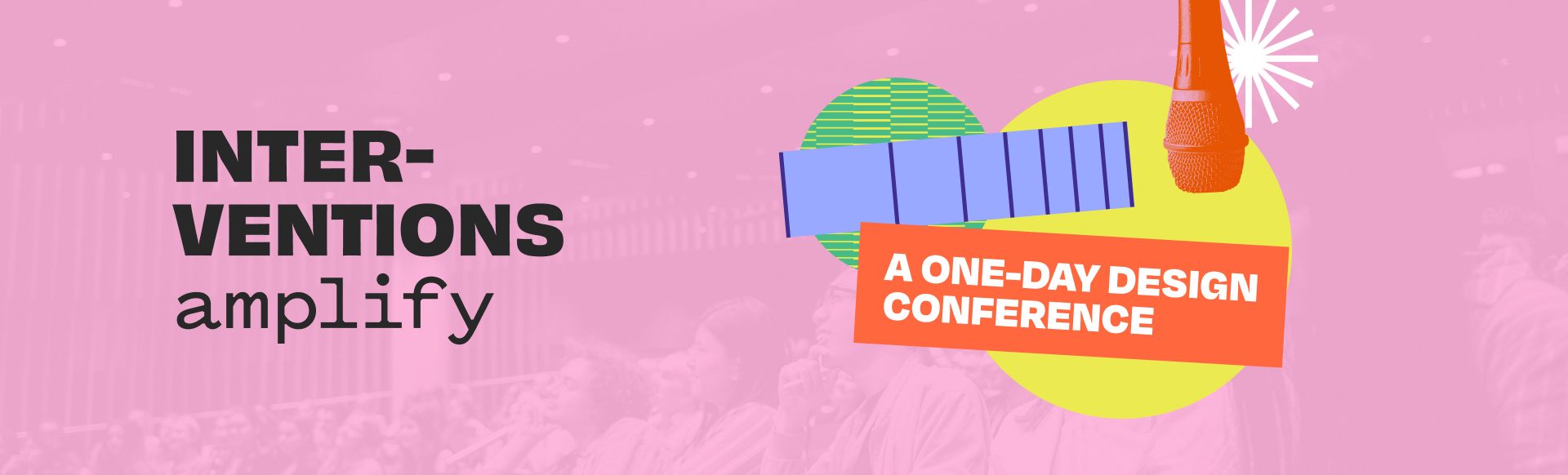
Interventions: Amplify
Creating an annual student design conferenceROLE
Graphic, Brand, and UI Designer
Graphic, Brand, and UI Designer
TOOLS
Figma, Figjam, Adobe Illustrator, Adobe Photoshop
Figma, Figjam, Adobe Illustrator, Adobe Photoshop
Prompt
Create an identity, brand, and collateral for Scout’s annual design conference.
Every year, Scout holds Interventions, a conference to connect Boston students to the greater design community through speakers and workshops. As a designer, I was responsible for building the brand and identity from the ground up.
The Conference team consisted of 25 students, from marketing to experience to developers, working together in weekly sprints.
The Conference team consisted of 25 students, from marketing to experience to developers, working together in weekly sprints.
Ideation
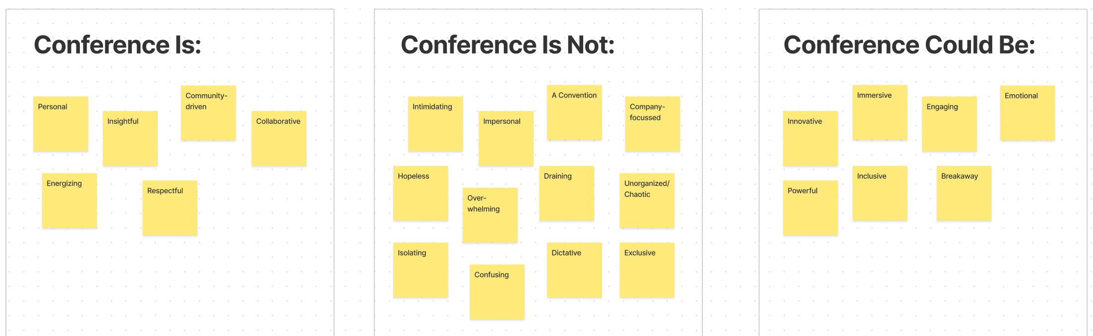
We started by meeting with the marketing team to define Intervention’s name and theme. After 2 years of virtual conference, we wanted our return to in-person to reflect the ways in which the world has changed.
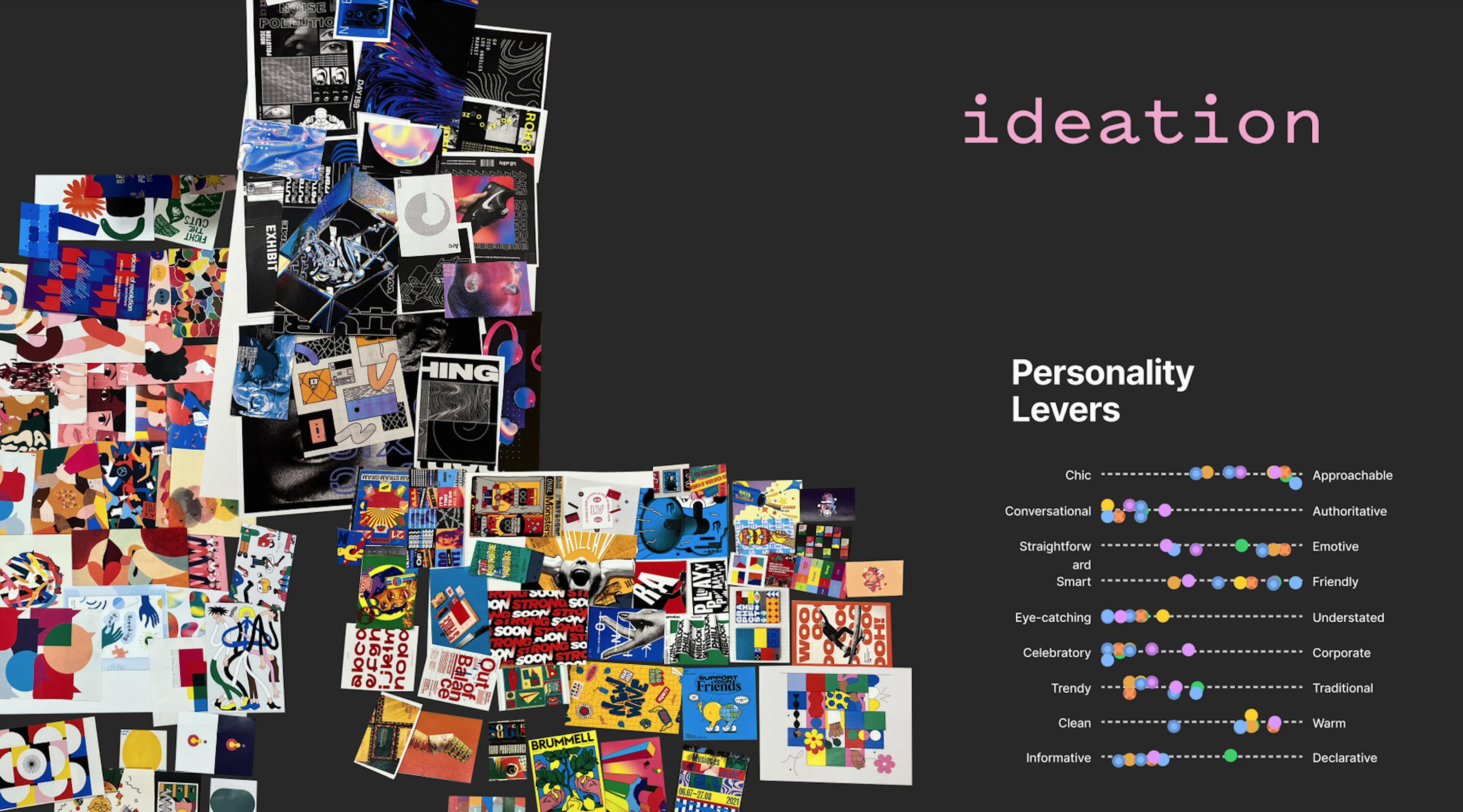
Starting with personality levers, we began to refine our identity. We wanted to celebrate our return to in-person with a bold yet approachable conference, making our mark but also rebuilding our community.
![]()
![]()
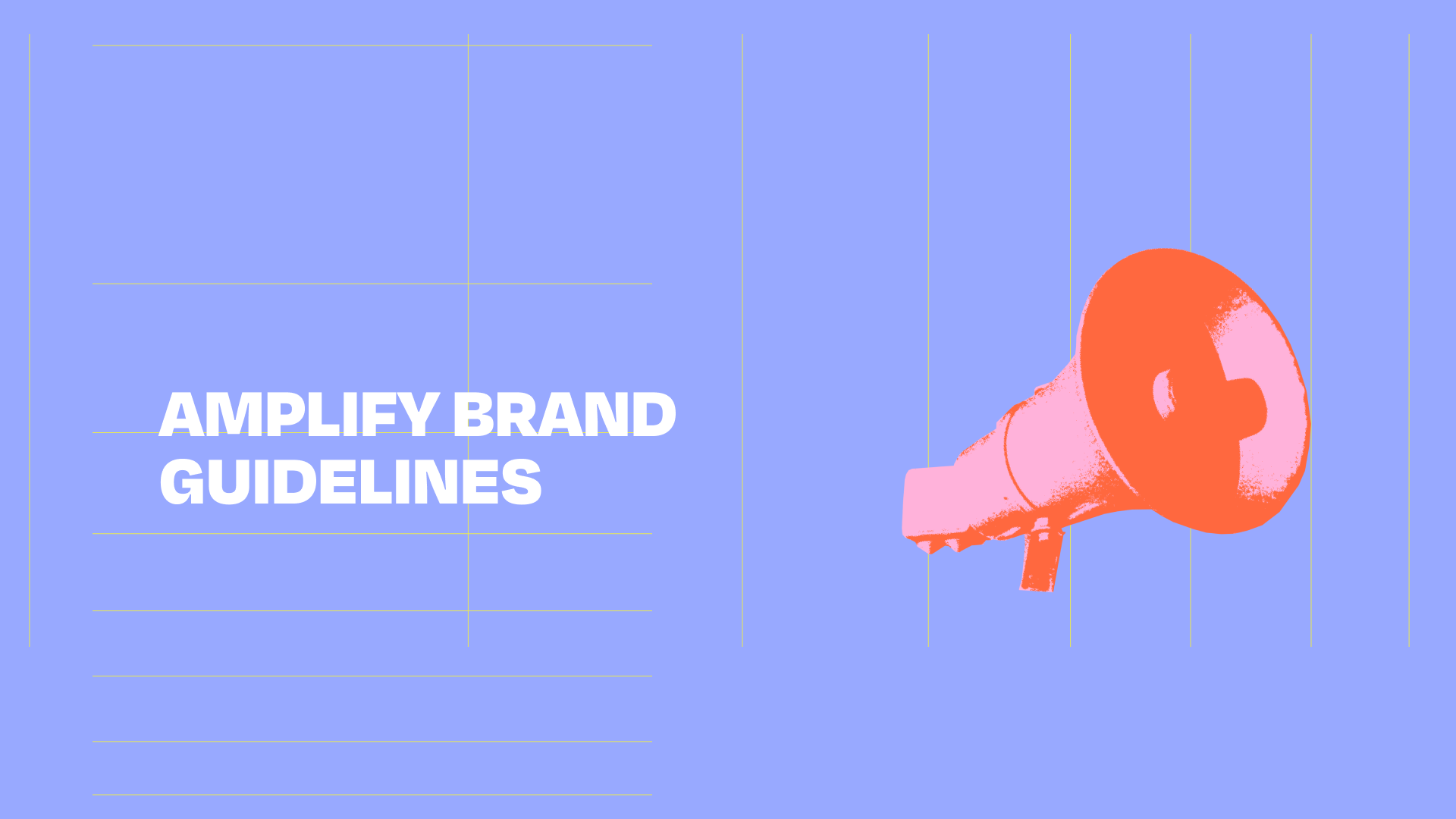
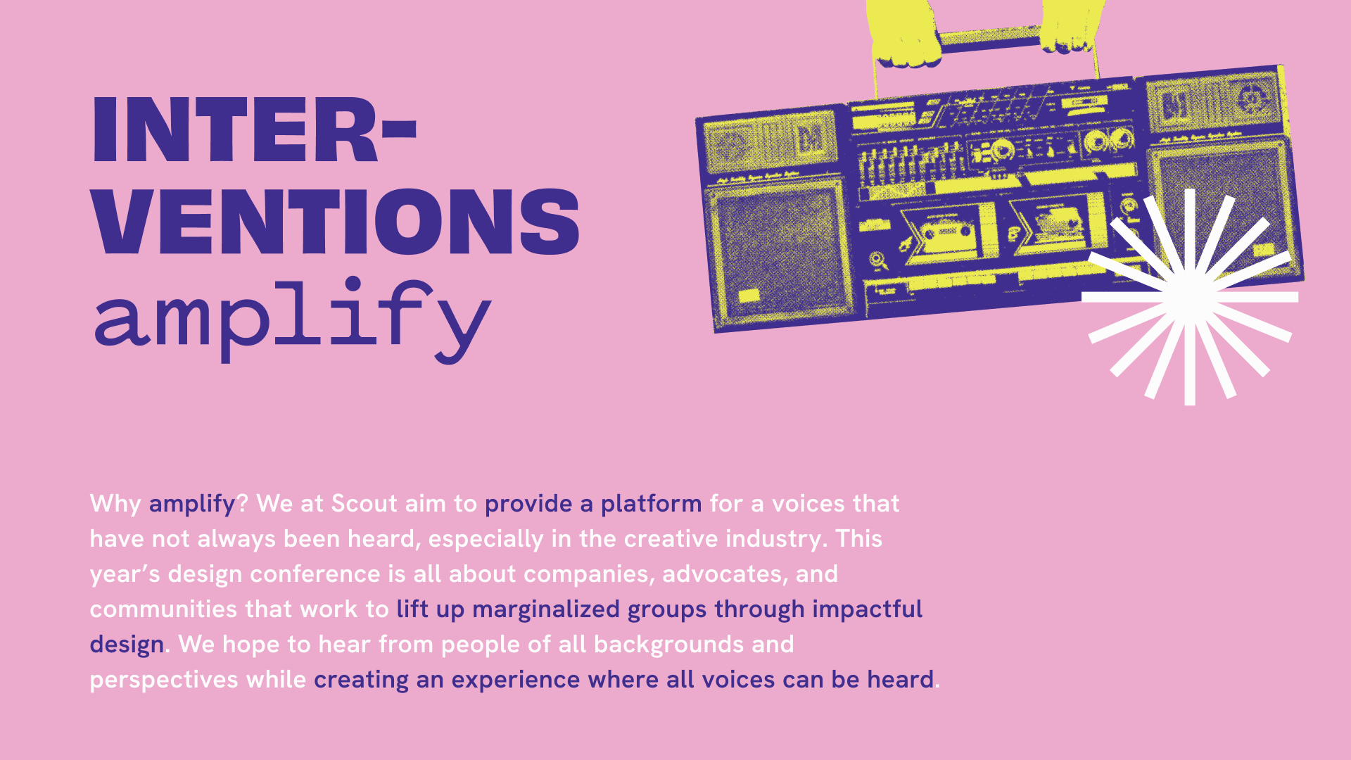
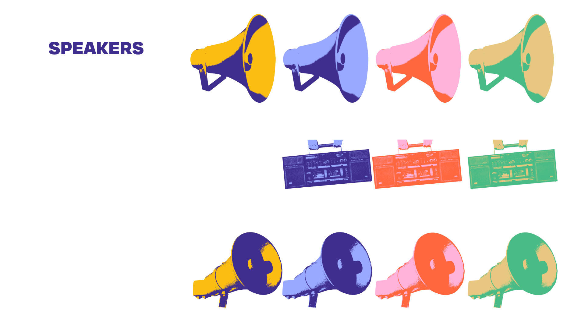
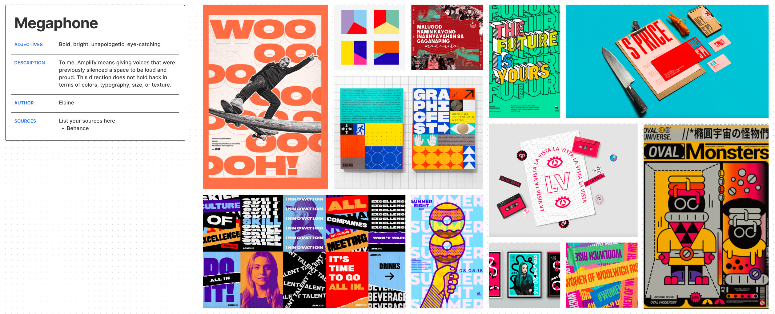
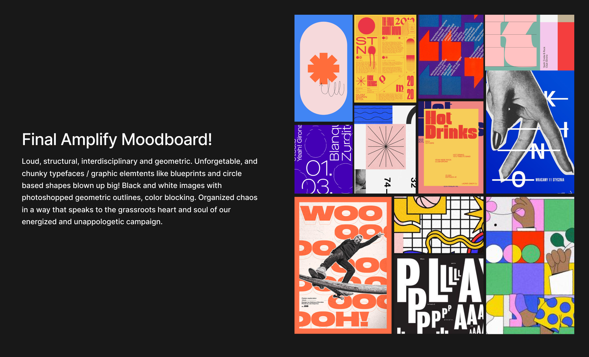
After deciding on a general tone, we moved into creating a central theme. My proposal, Amplify, focused on amplifying marginalized voices in design. Inspired by recent movements for social change, this direction would be vibrant and unapologetic.
Amplify was ultimately selected by the team as the year’s theme, and we moved to iterating on the design system.
Brainstorming Exercises, Moodboards, and Pitches
We started by meeting with the marketing team to define Intervention’s name and theme. After 2 years of virtual conference, we wanted our return to in-person to reflect the ways in which the world has changed.
Starting with personality levers, we began to refine our identity. We wanted to celebrate our return to in-person with a bold yet approachable conference, making our mark but also rebuilding our community.
After deciding on a general tone, we moved into creating a central theme. My proposal, Amplify, focused on amplifying marginalized voices in design. Inspired by recent movements for social change, this direction would be vibrant and unapologetic.
Amplify was ultimately selected by the team as the year’s theme, and we moved to iterating on the design system.
Brand and Identity
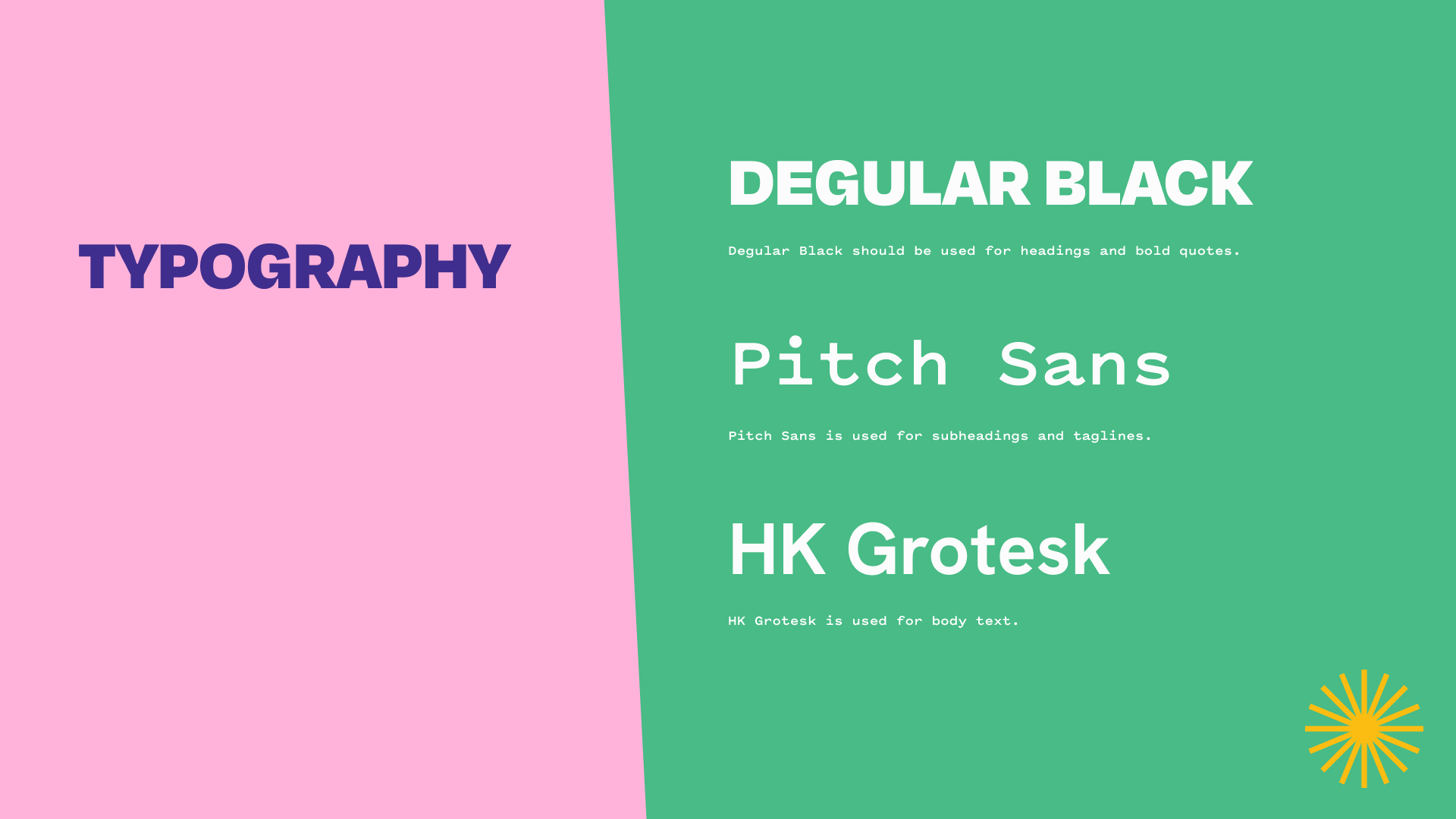
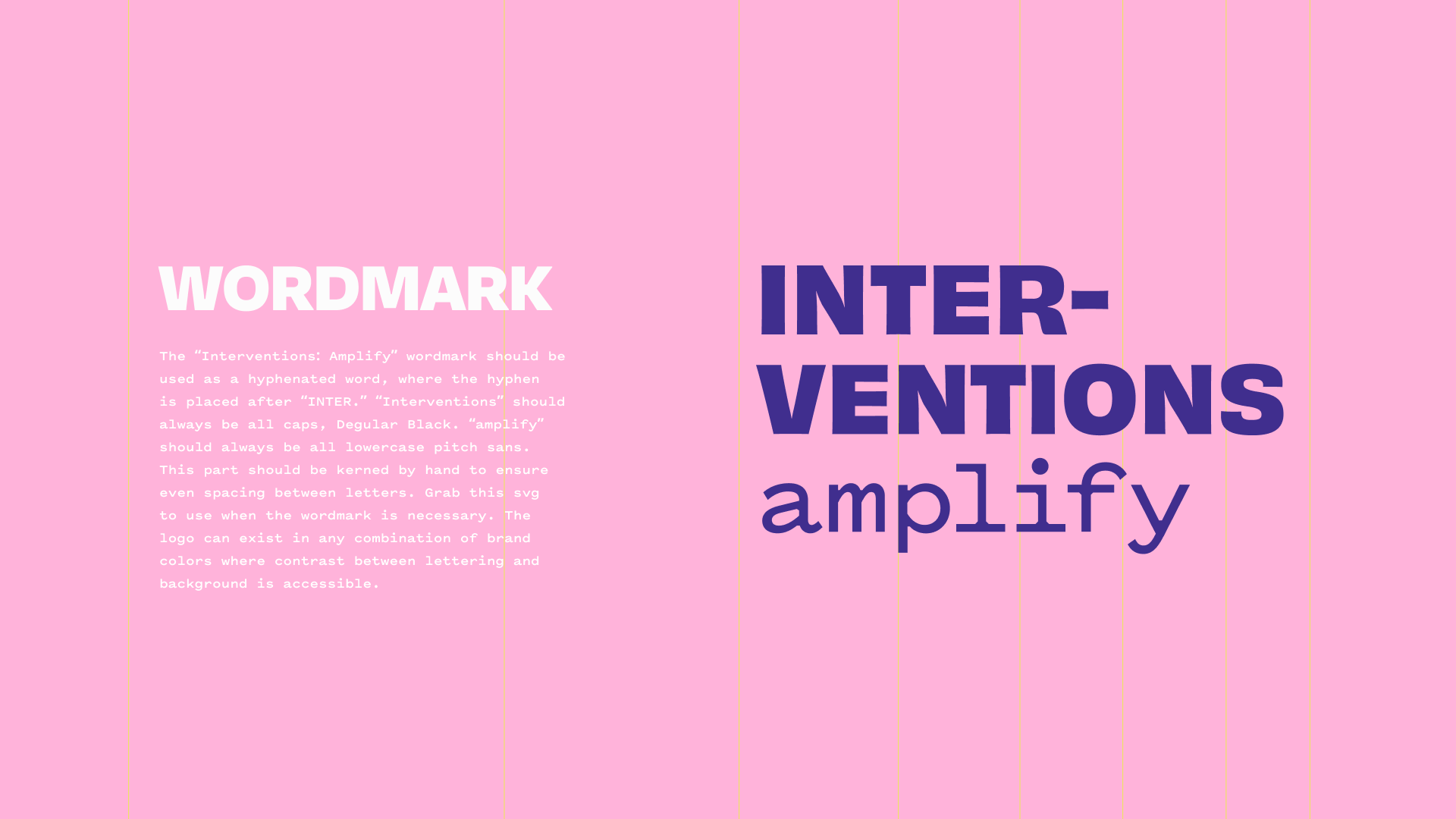
Design System
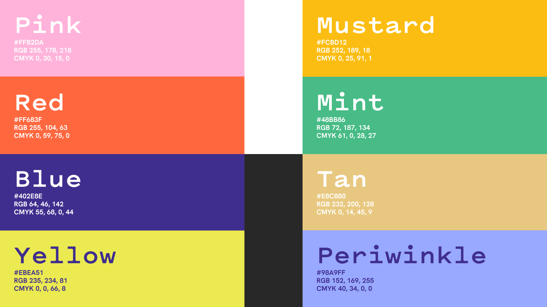
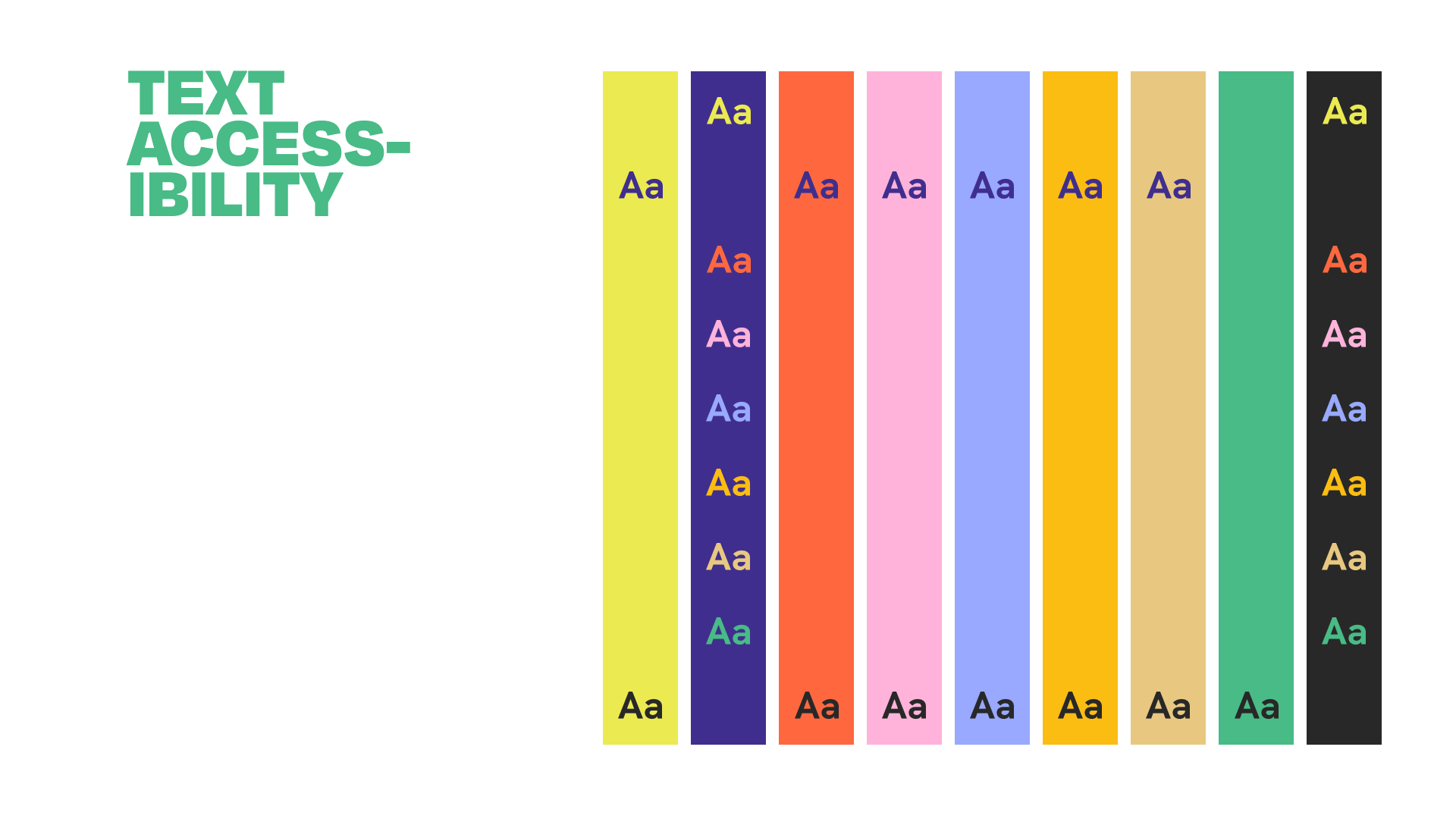
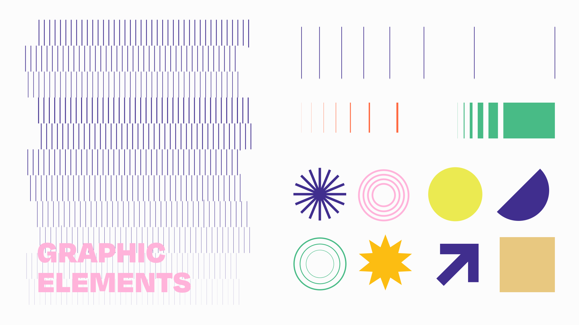
After several rounds of iteration, we arrived at our finalized direction. Our design included bright colors, bold text, and a combination of geometric and graphic elements to align with the organized chaos and energy of our conference.